Focus Active Rebranding Logo Design
Focus Active is a Singapore based activewear boutique that brings you curated pieces from the best brands across the world. They choose their partners carefully for their style, quality and personality.
Focus Active believes that fitness is for everyone and we want to help our community discover their potential and become the best versions of themselves. They also believe that being active is essential. Focus Active wants to be the Yogis, the Cross-fitters, the Long Distance Runners, the Gym Buffs and more.
So get into it, whatever your jam is. Just keep moving, and focus on living active.
Rebranding | Brand Identity Design | Packaging Design

A Need For Rebranding
In a world where trends are constantly changing, it can be hard to maintain a modern image. Rebranding is an option that business owners often overlook, but keeping the look and feel of your brand fresh and current can be the key to keeping your company at the top of your industry.
What are The Top Benefits for Rebranding?
1. Connect With a New Customers
2. Set Yourself Apart From Your Competitors
3. Stay Current
4. Reflect New Goals, Products, Offers, or Values
Logo Concept:
The initials outline that of a mountain, signifying challenges and the idea of wearers overcoming their adversities. Encompassing the iconic structure within a timeless shape depicts a sense of completeness and endurance. The colours were specifically chosen to evoke freshness and calmness, portraying an image which harmonises with the brand's ethics and beliefs.
Colour Palette:
The brand colours were handpicked to educe freshness and tranquillity, emitting a vibe synonymous with the brand's image. The more striking secondary colours were chosen to heighten the energy and vibrancy of the brand.
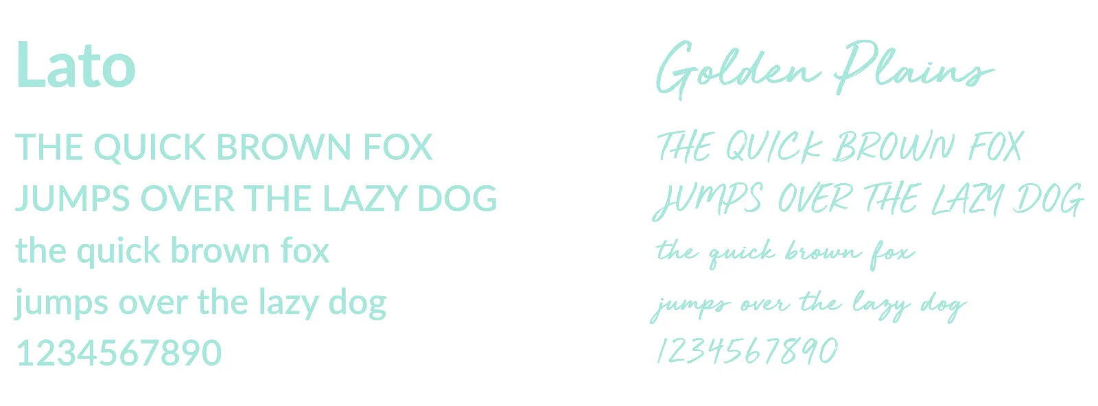
Typography:
Brand Graphic Element:
The primary graphic element is the cropping of Focus Active’s visual mark in different weights, representing people with different shapes and sizes being athletes of our brand.
The free-flowing pattern implies freedom in one’s active lifestyle. The pattern also takes inspiration from Memphis Design, a back-in-trend style, ensuring a form of relevancy today.


