Lookafter Vitamin Gummy Brand Identity & Packaging Design
Lookafter is a vitamin gummy brand that aims to educate and encourage millennials to look ahead and look after their health in a relatable and engaging way. The brand launched their first product of Digital Eyes because eye concerns are no longer age-related anymore in this digital era. No matter how old you are, taking care of your eyes is one of the best things you can do for yourself.
Art Direction | Brand Identity Design | Packaging Design

Lookafter Brand Personality
Lookafter is a fun and loving brand that wants to bring goodness to families, friends and the ones you care for. A honest brand that produce natural vitamin gummies that is affordable, making health supplements accessible to the community!
The Logo Concept
When it comes to the vitamin and supplement industry, less is always more! The logo took a sleek, minimalist approach that is bold, eye-catching and memorable!
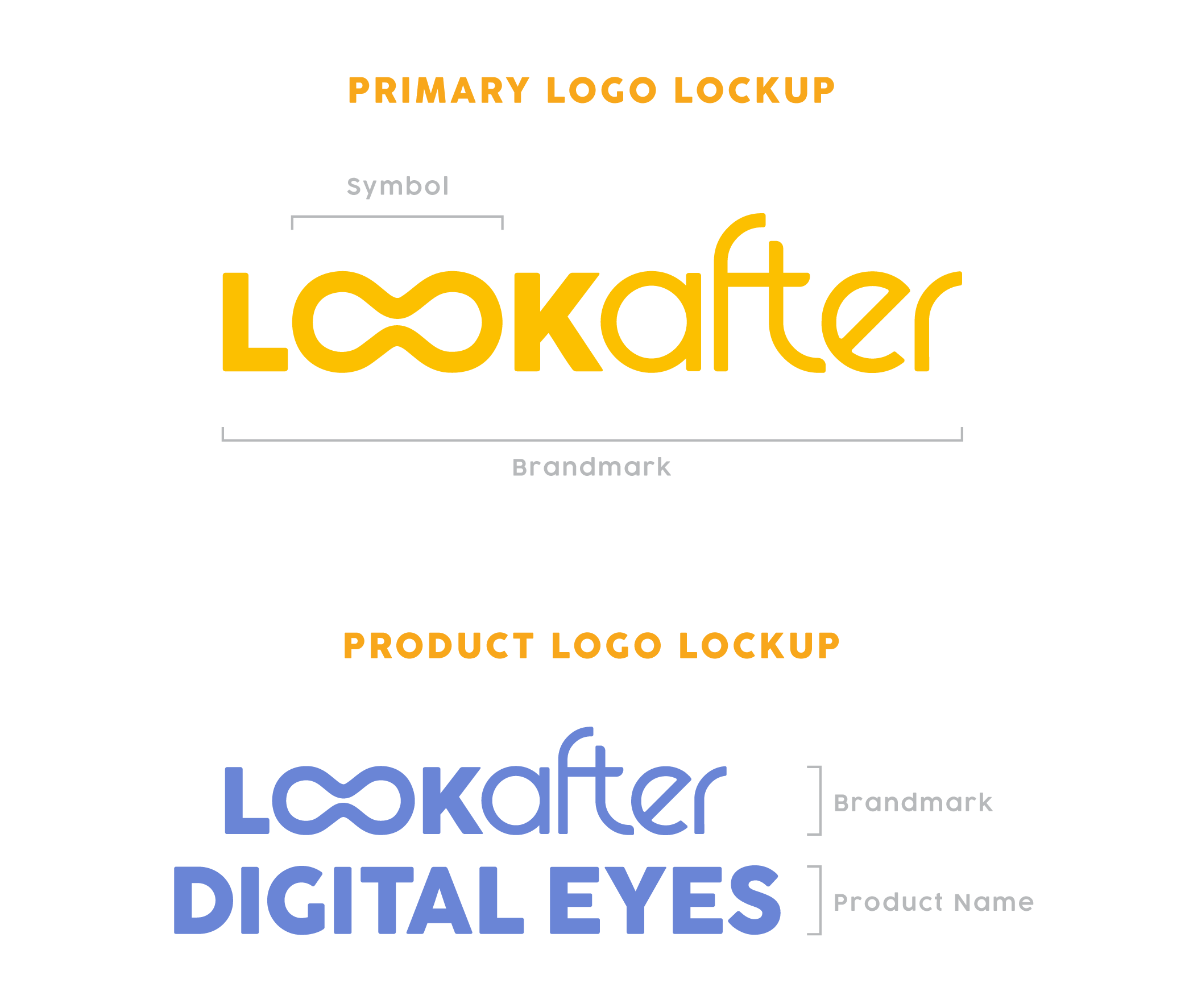
The logo consists of double hidden meaning that subtly communicates Lookafter brand mission. The double ‘O’s is morphed into a pair of binoculars to signify “looking far ahead” to take care of one’s health, and the shape also resembles an infinity symbol that signifies the concept of living longer and “forever” when one’s health is taken care of. The rounded sans serif logotype evokes a soft and friendly vibe which is synonymous with the brand’s personality.

Lookafter has a set of dynamic logo that goes beyond its primary logo lockup, it can adapt or change depending on the context or the audience.
Lookafter graphic illustrations are hand-drawn to provide the element of authenticity. The organic style gives a creative and playful vibe and reflects an honest brand with quality ingredients. The graphic element is placed on packaging design, or any other related documents. It could be used either digitally or on prints.


