VALVIN Coffee Scrub Branding
Just as your morning coffee, VALVIN coffee body scrub is the perfect partner to kick off your day. VALVIN strongly affirm that great confidence starts with healthy-living. One should look confident and most importantly, feel confident every single moment. VALVIN was established solely on this powerful mission and vision:
To deliver affordable yet effective skincare products to every corner of this beautiful planet. VALVIN believes that your skin deserves to be treated only with the most natural ingredients.
Here's the brand identity with a minimal approach using icons and strong colours to reflect the product richness and purpose of VALVIN.
Art Direction | Brand Identity Design | Packaging Design
The Brand Beyond A Logo Design
The name VALVIN came about as the combination of the founders’ nickname, Val and the other Vin. Taking a minimalist approach on the brand identity, the logo design stripped away all the unnecessary details to emphasise on the sleek, modern aesthetic that feels sophisticated yet timeless, making the brand memorable.
The initials of Val and Vin, forms a “W” which represents a wolf, symbolising beauty, self-confidence and pride, which is what VALVIN is all about. The incomplete and reduced letterforms portray the idea of removing imperfections - just as the coffee body scrub does to your skin - leaving you a smooth glowing babelicious skin. The terminal of “VV” is also cleverly morphed into a coffee bean that conveys the nature of VALVIN where all its body scrubs came from.
VALVIN’s colour palette were handpicked to educe luxury and boldness, emitting a vibe synonymous with the brand’s image.
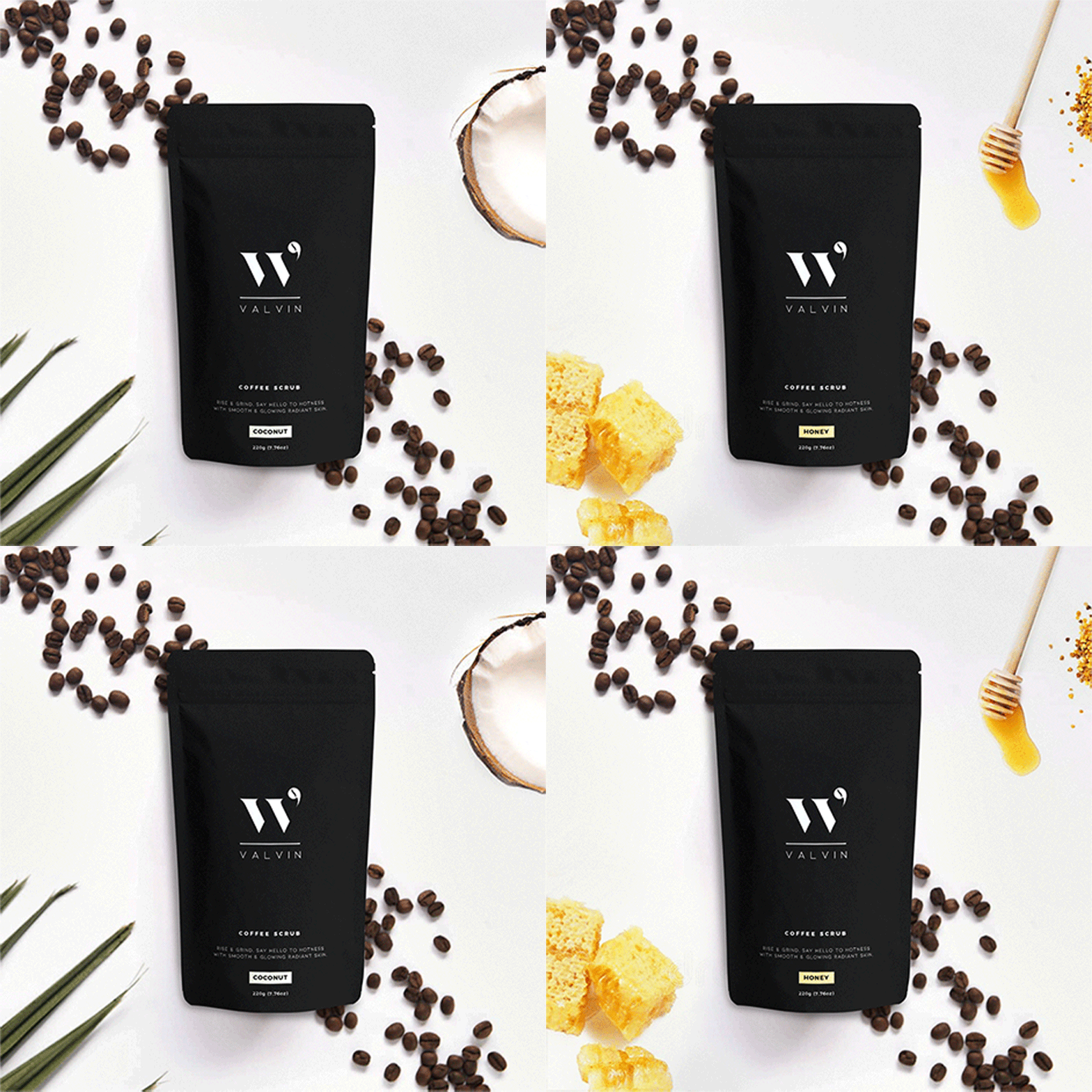
Creating The Perfect Packaging Design
Black and white cosmetics packaging is a trendy yet timeless trend we will never get tired of! VALVIN’s minimalist and sleek visual to evoke luxury and has an air of mystery and coolness.
The front copy of the aluminium foil package states “RISE & GRIND, SAY HELLO TO HOTNESS WITH SMOOTH & GLOWING RADIANT SKIN” while the back affirms “SAY GOODBYE TO INFLAMMATION, CELLULITE, DULL SKIN, DARK CIRCLES, PUFFINESS”. Notice that the goodbye phrase is just before the tear line of the packaging, that’s right you are tearing away all the negativities that VALVIN coffee scrubs removes as well.


VALVIN x BECCA
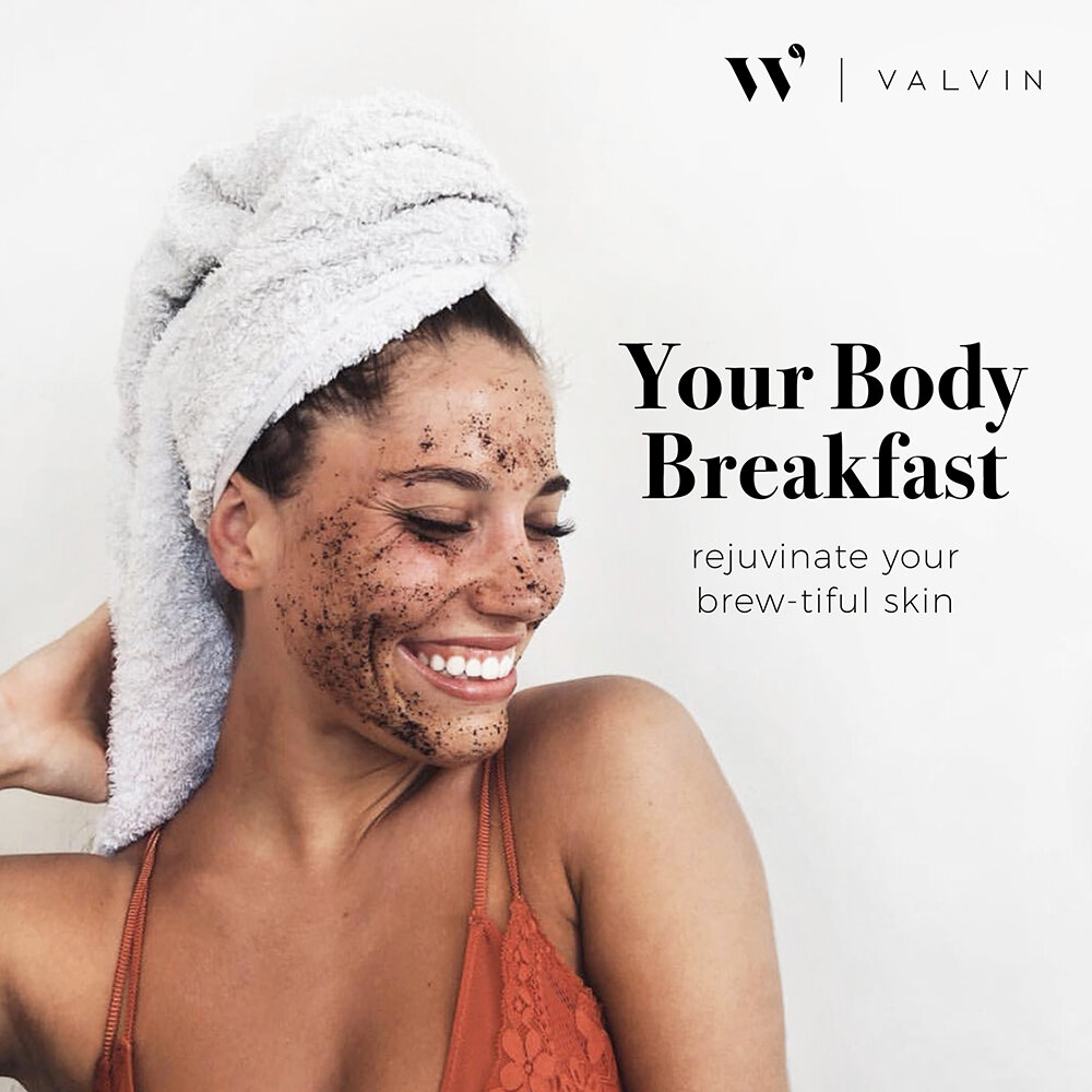
Since marketing and social media are harmonised we witness a lot of new approaches coming out. Here, we employed a give-away collaboration with a very talented blogger @beccabeczten.
Glowing skin starts with coffee scrub with a mix of coffee and coconut, smelling like a total tropical paradise that’s nourishing for the skin! 🌴🥥


