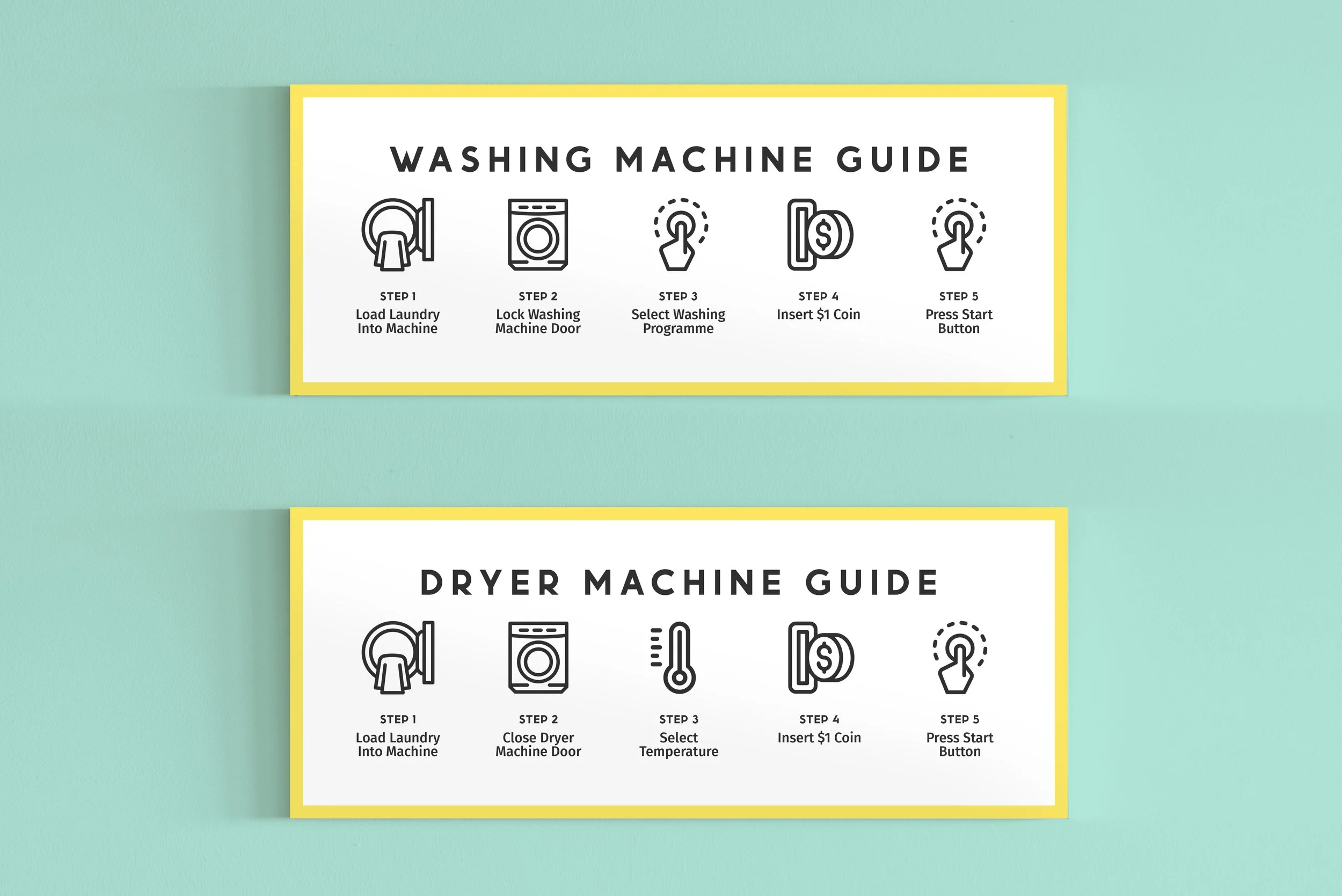
LaundroMate Tanjong Pagar Logo and Shop Front Design
LaundroMate is your friendly neighbourhood laundromat! Cleaning is a topic that people are not comfortable speaking about openly in Singapore. Breaking away from the norm of laundromats portrayed in this city, this logo design took a fresh minimalist approach. Designed with the concept of “Less is More”, the letter ‘O’ in the logotype is morphed into a washing machine. This simplistic logo design is modern, timeless and reflects the brand’s personality traits.
The inclusion of “Tanjong Pagar” helps to strategically target the audience in the area since laundromats are almost widely available across the city. As blue is often associated with washing or cleaning, a pastel teal is carefully picked to stand out from LaundroMate’s competitors.
Brand Identity Design | Store-Front Design


