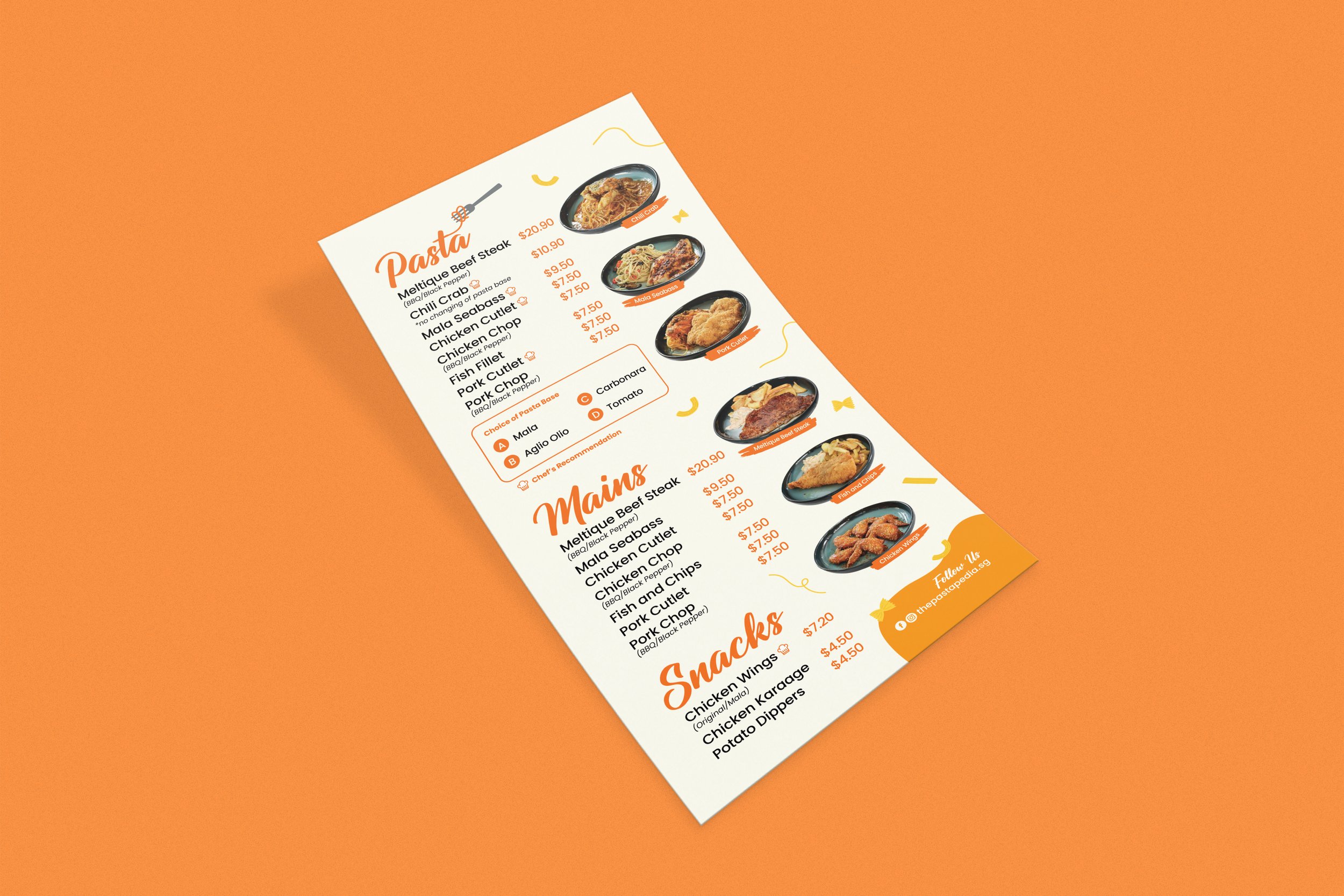
The Pastapedia Logo and Menu Design
The Pastapedia is a long time embedded dream founded by a young couple who loves pasta as well as people!
Brand Identity Design | Menu Design
The logo is designed with a cursive font that resembles spaghetti noodle that flows to form the brand name. The rounded corners of the typeface also reflects softness that evokes friendliness, welcoming customers to dine at The Pastapedia. The spaghetti forms a heart on the fork, symbolising love and passion that connects pasta and the people. Orange is chosen as it is a vibrant colour that attracts attention. It also has powerful physical effects, including increased metabolism and blood pressure which can boost appetites!


